


What would you say if someone told you that many academics, the US government, and the media overstate income inequality, understate the real income growth of US households, overstate poverty, and understate income mobility? If someone had asked me, I would have said I believe it. I’ve followed these issues, and even written about most of them. But on reading The Myth of American Inequality: How Government Biases Policy Debate, even I was blown away by the strength of the evidence for these conclusions.
The book’s three authors are former US senator and former economics professor Phil Gramm, Auburn University economics professor Robert Ekelund, and former assistant commissioner of the Bureau of Labor Statistics John Early. The authors take a deep dive into the data and use largely government-generated data to make their case. They point out that in computing household incomes, the US Census, part of the Department of Commerce, systematically leaves out two-thirds of the transfer payments that federal, state, and local governments give to people. This dramatically understates income of people in the lowest-income two-fifths (which economists and statisticians call quintiles) because these two quintiles, and especially the lowest, receive a hugely disproportionate share of transfer payments. The Census also leaves out taxes paid to federal, state, and local governments. Because higher-income people pay most of the taxes, failure to subtract these taxes substantially overstates the income of higher-income people. Both factors cause the Census Bureau to systematically overstate income inequality. They also show that the government’s usual measure to adjust for inflation, the Consumer Price Index, systematically overstates inflation and, therefore, understates the growth of real wages and real household incomes. Adjusting the data for both transfer payments and the overstatement of inflation, the authors show that the percentage of US households in poverty, rather than being in the low teens, is actually only about 1.1 percent.
Along the way, the authors show that US income mobility is high: the vast majority of people, over their lifetimes, move from one quintile to another. They also dispel a number of myths about the rich, the top 1 percent, the top 0.1 percent, and the incredibly wealthy Forbes 400. As a disturbing bonus, they show that in recent years some federal government agencies have encouraged people to be more dependent on government welfare.
Omitted Income and Taxes
In 2017, US governments at all levels gave an average of $45,389 in transfer payments to households in the bottom quintile of the income distribution. Of this, the lion’s share, $41,783, was given by the federal government. These federal transfer payments were Social Security Old Age and Survivors Insurance ($10,958), Medicare ($7,986), Social Security Disability ($2,575), Medicaid and the Children’s Health Insurance Program ($9,634), food stamps ($1,504), and miscellaneous programs ($9,126). But the federal government does not count these payments unless they are in cash. So, as far as the feds are concerned, Medicare, Medicaid, food stamps, and housing subsidies, to name four major programs, don’t count.
My only major criticism of the book is that the authors assume that a dollar in Medicare or Medicaid spending is like a dollar in cash. Certainly, the recipients typically value those programs highly, but economists tend to be skeptical of the idea that giving people in-kind benefits gives them as much as value as they would get if the government gave them cash. The test of whether they value them as much as cash is whether, if they were given cash, they would spend it on the specific medical care that the government spends for them. MIT health economist Amy Finkelstein and her co-authors have estimated that Medicaid beneficiaries value the benefits at between 20 and 40 cents on the dollar. Still, 20 to 40 cents on the dollar is way more than the zero that the Census Bureau assigns. And there is no excuse for the Census Bureau not counting the Earned Income Tax Credit (EITC), which goes entirely to low-income people and really is cash.
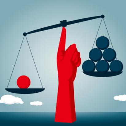
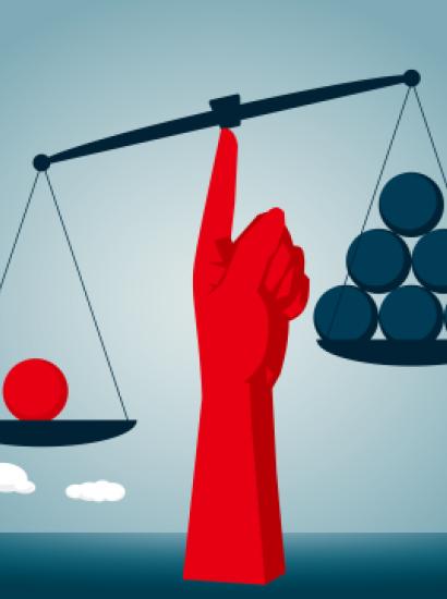
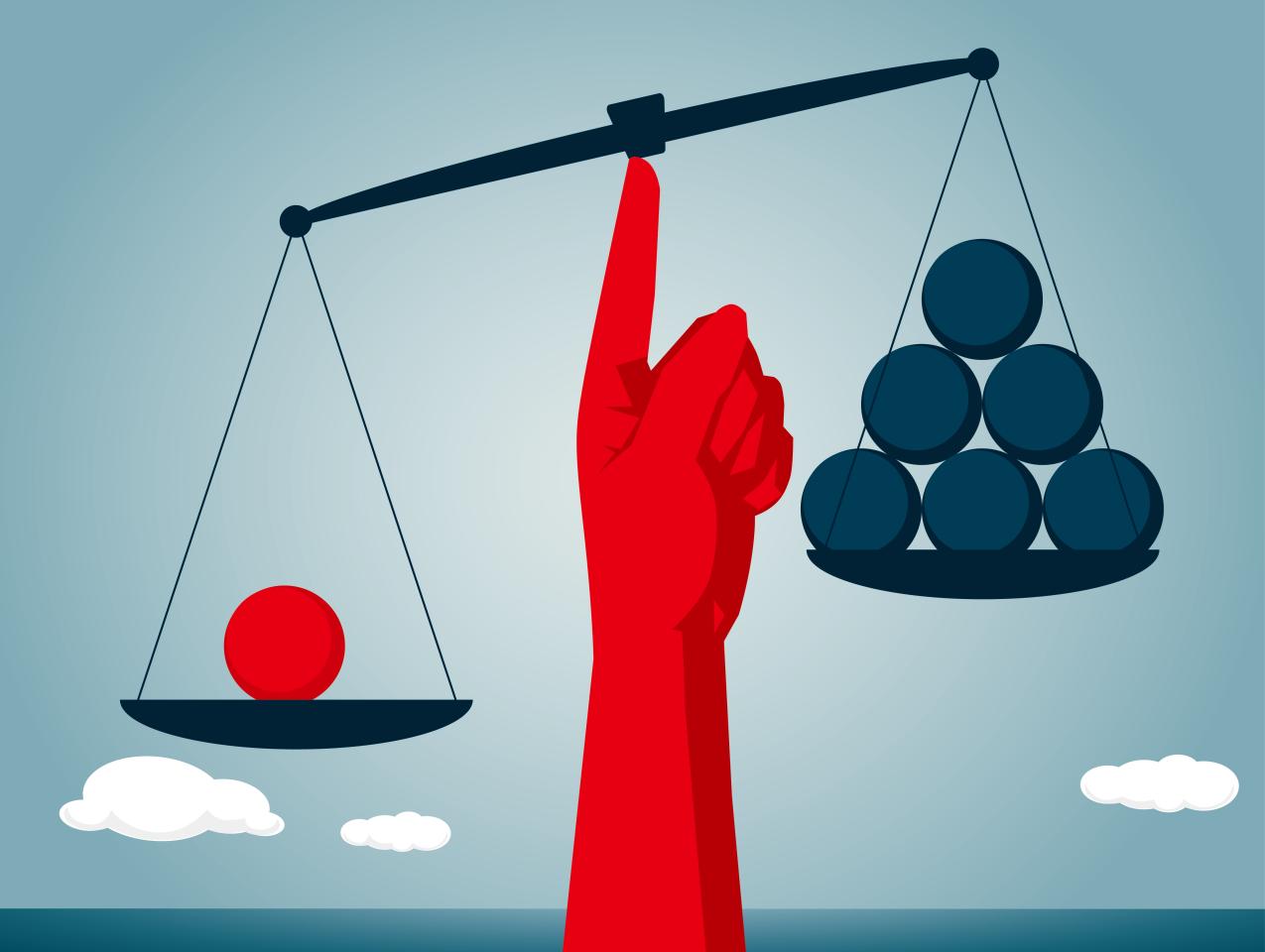
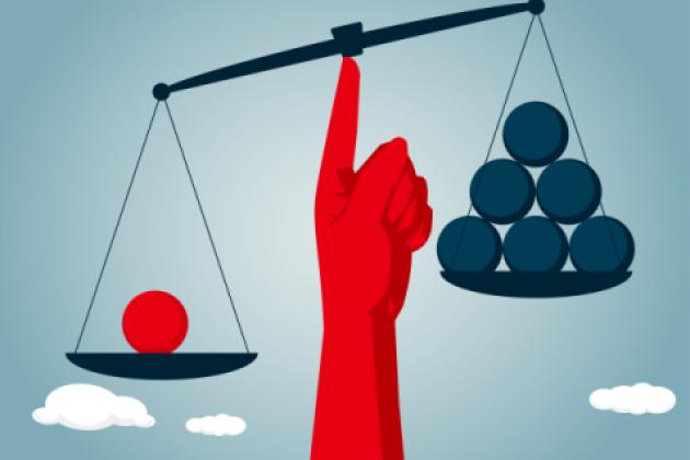
There is also no excuse for not subtracting taxes from income. Gramm et al. correct the measures by adding in all the omitted transfers and subtracting all taxes. The results they get differ dramatically from the Census numbers. Whereas the Census approach concludes that the ratio of the top quintile’s income to the bottom quintile’s income is a whopping 16.7, the authors show that the ratio, after correcting for transfers and taxes, is 4.0. In other words, the Census Bureau’s measure overstates inequality by over 300 percent.
Notice the irony. Many politicians and many in the media and academia advocate reducing inequality by expanding the Earned Income Tax Credit or by making the food stamp program more generous, to name two such proposals. But the measure of income inequality that led them to advocate these policies would show that if they succeeded in getting these policies implemented, low-income households’ income would not increase and income inequality would not fall. Indeed, by Census measures, low-income households’ income would fall and income inequality would increase. Why? Incentives. I turn to that next.
The Missing Workers
One of the book’s many strengths is the authors’ careful analysis of the data on earned income by various quintiles and the causes of that earned income. For the bottom quintile in 2017, wages, salaries, and benefits per household averaged a paltry $4,428. The average of workers per household in the lowest quintile was only 0.2. In other words, there was only one worker for every five households. Contrast that with the top quintile. Households in that quintile averaged $246,275 in wages, salaries, and benefits. That’s a ratio of 55.6 to 1. The top quintile averaged 2.0 workers per household, which means that its households had ten times as many workers as the bottom quintile. But that 10 to 1 ratio is not the only factor contributing to the 55.6 to 1 ratio in earnings. Two other factors mattered: average hourly earnings and hours worked. The top quintile made $52.12 per hour, versus the bottom quintile’s $11.76. The top quintile’s workers also worked more hours per week, 38.6 versus only 17.3 for the bottom quintile.
But why do so few workers in the bottom quintile work and why do the few who do work do so for so few hours? One reason is that about half of the adults in those households were retired. But even of those between ages eighteen and sixty-four who were neither retired nor full-time students—economists refer to them as prime-age—only 36 percent worked.
That’s a problem. For many of them, their decision not to work can be traced, in large part, to the expanded welfare state. To be willing to work, you need an incentive to work. The welfare state has, for millions of prime-age people, made that incentive tiny. One of the authors’ most striking numbers is their comparison of income earned, transfer payments received, and total income of the average household.
The average earned income of the second quintile was $30,931 and of the lowest quintile was $4,908. (Why not the earlier mentioned $4,428? Because the $4,908 number includes returns on investments and savings.) That’s a difference of $26,023. But the second quintile received “only” $29,793 in government transfers per average household and $2,041 in private transfers, for a total of $31,834, versus $45,389, $3,313, and $48,702 respectively for the lowest quintile. So the second quintile’s extra $26,013 in earnings was offset by $16,868 less in subsidies. It gets worse. The lowest quintile paid $3,996 in federal, state, and local taxes while the second quintile paid $8,841 in taxes, a difference of $4,845. The net gain from working for the second quintile, therefore, was a measly $4,310. Similar calculations to those above show that while the average household in the middle quintile earned $35,217 more than the average earned by second-quintile households, their net increase in income, due to lower transfer payments and higher taxes, was only $11,707. That’s not a large incentive to earn income.
Real Incomes, Real Wages, Poverty, and Price Indexes
Economists who have studied the issue carefully have concluded that the consumer price index (CPI) that the Census Bureau uses to estimate inflation systematically overstates inflation. It fails to capture the fact that people substitute away from items whose prices have increased more to items whose prices have increased less. Economists call this the substitution bias. It also fails to capture many major improvements in goods and services as disparate as cell phones and medical care. The authors have a wonderful discussion of those issues. Actually, Hoover economist Michael Boskin, who headed a Senate committee in 1996 that found systematic overstatement of inflation, has written an excellent piece on it, “Consumer Price Indexes,” in David R. Henderson, ed., The Concise Encyclopedia of Economics. Over many decades, even a small overstatement matters a lot. It doesn’t add up; it compounds up.
The index for inflation matters for estimating three things: (1) the growth in real wages, (2) the growth in real household incomes, and (3) the reduction in poverty.
Gramm et al. note that while using the CPI shows a measly 8.7 percent growth in real wages between 1967 and 2017, using a measure that corrects for substitution bias and for improvements in the quality of goods and services yields the conclusion that real wage rates over those fifty years rose by a whopping 74.0 percent. Over that same period, using the CPI shows that real median household income rose by 33.5 percent, but using a price index that accounts for substitution and quality improvements shows the increase to be 93.3 percent.
That seems to accord with our observations. Think about what people have now that they didn’t and how those things have contributed to their well-being: houses with two bathrooms and widescreen TVs, mobile phones that can be direction finder, music player, calculator, and more, and medical care that improves our life expectancy and keeps us from having long stays in the hospital. Those are only three of many improvements.
Similarly, using a more-accurate measure of inflation, and including government transfers, leads to the conclusion that in 2017 only 1.1 percent of households in America were poor.
One disturbing item the authors note is the change in the attitude of the US government toward dependence on welfare. They quote FDR’s statement that the “federal government must and shall quit this business of relief.” But between 2000 and 2016, they note, the US Department of Agriculture “conducted aggressive recruitment efforts” to boost food stamp enrollment. The USDA even advertised to seniors and Hispanics that they, in the authors’ words, “should feel guilty because, by refusing to apply for them [food stamps], they were hurting their families.”
The Rich
The current commentator who has arguably misled people the most about the rich is French economist Thomas Piketty. I laid out a number of problems with his neo-Marxist thinking in my review of his 2013 book, Capital in the Twenty-First Century, but Gramm and his co-authors dig into his data more than I did and point out huge shortcomings that badly distort the picture. Along the way, they show that the heirs of the richest people in society tend to dissipate those riches in a few generations. The old saying “shirtsleeves to shirtsleeves in three generations,” which means that one generation builds the wealth and the next two dissipate the wealth, is approximately correct. They write, “[T]he wealthiest families from the nineteenth century are all but gone from the ranks of the wealthiest, and most of those from fifty years ago are gone as well.”
Moreover, those who hold on to their wealth are doing the rest of us a huge favor. Warren Buffett with his wise investments and Bill Gates with Microsoft’s innovations have not only made tens of thousands of investors into millionaires. Gates has also benefited billions of people with Microsoft’s products.
Do the rich pay their fair share in taxes? Your conclusion depends, of course, on your definition of fairness, but what the authors show is that the rich pay a huge percent of their income in taxes. In 2017, the top 1 percent paid about 40 percent of their income in taxes while the bottom quintile paid only 7.5 percent. Can anyone seriously argue that the top 1 percent got commensurate benefits from governments in the United States? For the top 400 households, tax rates were “only” 32.0 percent of their income. But the authors note that that group is minuscule, constituting only “three out of every million American households.”
Conclusion
The authors end with three suggested reforms, making a strong case for each: (1) having Congress require the federal government to report more-complete data, (2) legislating school choice, and (3) reforming occupational licensing to make it easier for workers to advance in the economy.
They end with an inspiring message: “Our goal must be an America where people can rise as high and go as far as the sweat of their brows will take them and know the triumph of that achievement, whether it be large or small, belongs uniquely to them and those who love them.” Amen.