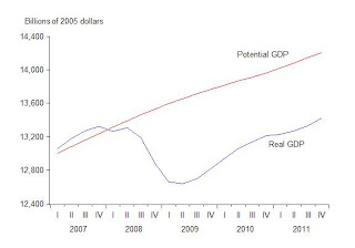
What are the implications of all the recent economic reports (January employment, 4th quarter GDP, CBO’s downward revision of potential GDP) for an assessment of the recovery from the 2007-09 recession? In my view, they still indicate a very weak recovery. As I have argued, a good standard of comparison for this recovery is the most recent recovery from a very deep recession, namely the one that ended in 1982, and I have offered a series of charts to make the comparison easy and objective. Here are updates of those charts based on the latest data.
The first chart shows real GDP during the 10 quarters since the end of the 2007-2009 recession along with CBOs recently revised estimate of potential GDP. The chart clearly shows that the economy has yet to recover back to its potential. The only real difference from earlier assessments is that CBO has slightly lowered its estimate of potential.
For comparison, the next chart shows the recovery back to potential in the 10 quarters following the 1981-82 recession.


